How to Leverage CSS to Enhance Your Website Layout?
What is CSS?
Cascading Style Sheets (CSS) is a programming language for the web. CSS is used to style webpages and works in tandem with HTML and JavaScript. CSS is a declarative programming language like HTML. These languages are easy to use because they are primarily descriptive in nature and don’t require any understanding of logic. HTML marks up content by wrapping it in tags that denote the beginning and end of an element or container. CSS involves supplying name-value pairs. CSS has pre-defined properties that style the HTML layout in different ways and expect certain values. For example, sometimes a strategy for showing different layouts depending on the screen size the page is being rendered on is to include all 3 layouts in the same webpage and set the display property of a layout container to the value block or none depending on screen size rules defined by media queries. CSS properties are applied to HTML elements through the use of selectors. Some ways CSS can apply a property to an HTML element is by using the elements id, class name, or tag name. Many CSS properties can be applied to the same HTML element inside a block of code denoted by curly braces (e.g., left and right). Each CSS rule or name-value pair inside the block is punctuated by a semicolon (i.e., line terminator).
What Can We Achieve with CSS?
Spacing
CSS is easy and fun to work with. You can do a lot of styling with CSS. CSS can be used to move elements in the direction of up, right, down, and left. This is achieved with the margin property. The values that margin takes are numbers as amounts of space to move. If you are placing an element inside a box with a background and the element is touching the edges of the box, the presentation may not look right. The solution is to add some spacing around the element in the box. This is done through the CSS padding property. The padding properties takes numbers as values as the amount of space to place around the element from the walls of the box or container.
Size
Length, width, and height are CSS properties that expect numbers as values when sizing elements. A fixed width option is not always the best option for flexible layouts that must scale with the screen as it changes size. Instead of providing numbers as values to the length, width, and height properties you can supply percentage values that will adjust relative to what the current state of the screen size is.
Structure / Layout
How about lining elements up in a row side by side? That is where the CSS float property comes in. Float takes the properties of the keywords left or right. The float of an element must be cleared or elements that follow will be out of position. The clear property that takes values like left or right is used to clear the float. The display property can be used to have elements formatted into a grid structure of rows and columns. Supply the value grid to the display property if you want to position elements inside a container in rows and columns. The properties grid-column start, and grid-column-end are used to define how many columns are required. Grid-row-start and grid-row-end define how many rows of elements there will be. Placing an icon next to paragraph text is normal practice for creating buttons that look good and are self-explanatory.
Color
Dealing with structure and layout is satisfying if you like applying principles of order, symmetry, size, and shape. However, what about principles of light like color? Be conservative with color when designing for web. Color is hard to work with, however, can be satisfying when you get the balance just right. Using color correctly can seriously enhance your web design. There are a thousand shades of the same color and lots of different color palettes to work with. Choosing the right color palette can be approached scientifically. There are only a handful of colors, and some colors are known to go together. Neutral colors can be used to help improve the harmony and balance of the color palette.
For text, the color property can take several value types. Some keywords like blue, green, and orange can be used as values for the color property. If you want more fine-grained control of the color you want to use, then you can use hex values with the hash tag symbol as the value for the color property to choose the exact shade of the color you want to use. The background-color property will fill a container with the color value supplied to it. Gradients are awesome to work with because you can apply shading to backgrounds or blend different colors in different directions and patterns. CSS has three types of gradients you can work with. For example, there are linear, radial, and conic gradient types. For gradients we are supplying values to the background-image property. Linear gradients means that the color can move in several constant directions in a line. The colors can change in the direction of down, up, left, right, and diagonal. For a linear gradient, the background-image property is assigned a CSS function called linear-gradient that expects a parameter for the direction and several colors.
Responsive Web Design
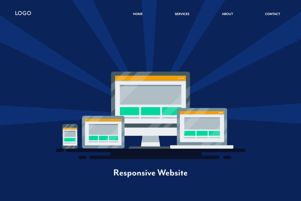
CSS is the best way to make your webpages responsive to different screen sizes. JavaScript (JS) can also make a webpage responsive, however the user can turn off JS in the browser. CSS cannot be turned off so it will always work in the user’s browser. We can accomplish a responsive webpage layout with CSS media queries. I like to make a small, medium, and large version of each webpage I make if I am building a custom website from scratch. How do media queries work? Media queries define a block of code where a webpage layout is defined inside which is triggered and then displayed when the devices window is the size of the dimensions defined in the media query. The media query has a few parts to it. The @media keyword is declared before any dimensions of the window are provided. The window dimensions are then declared inside left and right parenthesis and separated with the and keyword if there are multiple dimensional rules defined. The min-width and max-width properties expect numbers as values that define the boundaries of the layout and elements contained therein.
Animations
What about movement with the element of time? CSS has pre-built properties and functions for so many different types of animations. Keyframes are used to denote blocks of code where you can target CSS properties to have them change over time. The keyframe is assigned to a class selector that you can assign to any element you wish the behavior to apply to. How do the different animation rules inside the keyframe block change over time? Using the from and to keywords is one way to have one animation rule change into another. Another option is to define each animation rule with percentage values that define at what point each animation rule is triggered and when it ends.
The color property can be animated to have single or multiple colors change at varying speeds. If you are interested in having elements change position then you must target the top, left, right, and bottom properties and provide numbers or percentages as their values for how much they should move and in which direction. Would you like some of your webpage elements to grow or shrink in size for certain periods of time? If this is true, then target the width and height properties when defining an animation rule in your keyframe block. Maybe you would like some of your elements to do a vanishing act. If that is the case, the opacity or display property is what you wil be looking to target in your keyframe block. The opacity property expects a numeric value from 0-1 while the display property expects a keyword such as block or none.
Further Reading
W3 Schools
CSS Tutorial
MDN Web Docs
Using Media Queries
Tutorialspoint
What is CSS?
W3 Schools
CSS @Keyframes Rule
MDN Web Docs
@Keyframes


